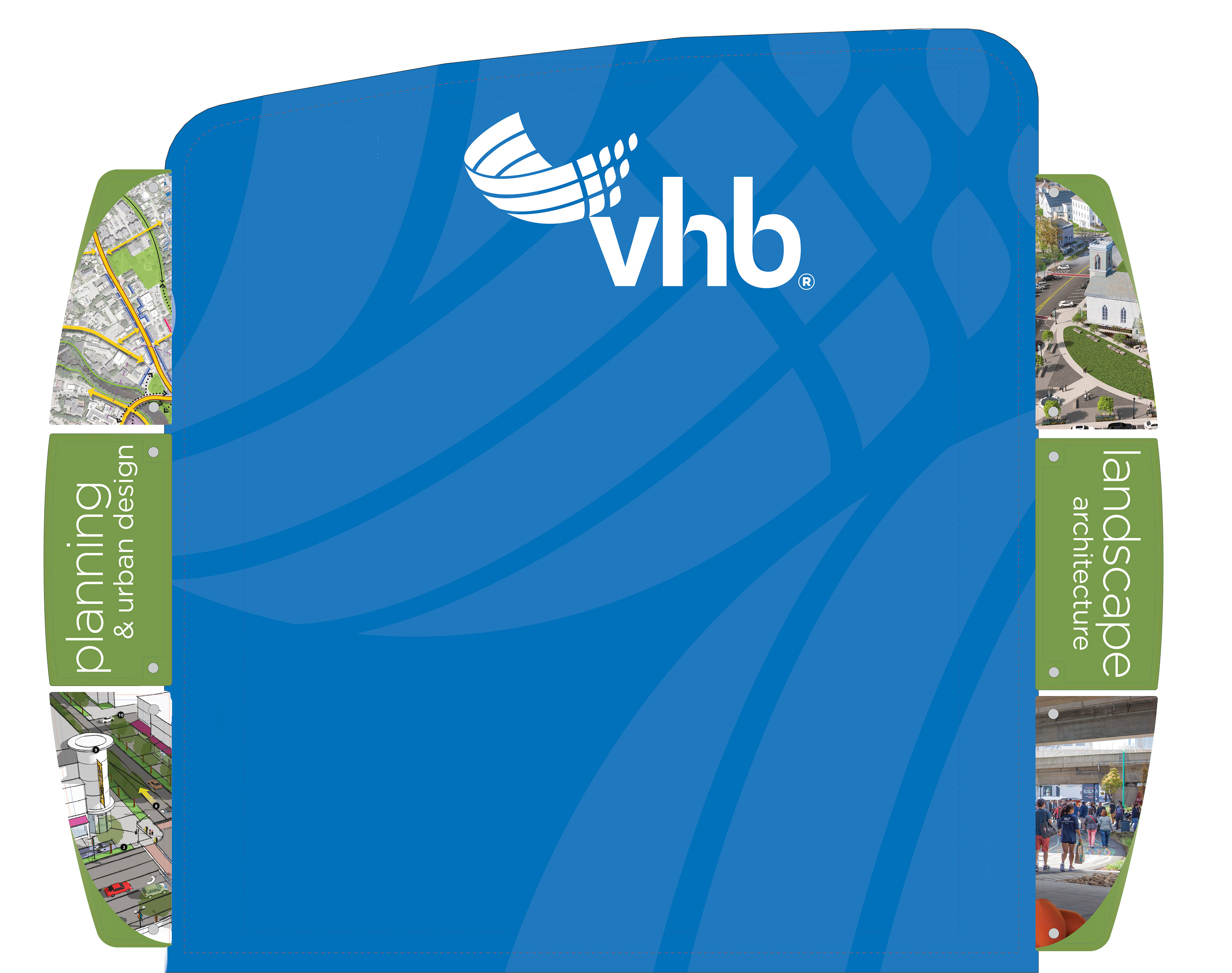

Infographic explaining Surban Neighborhoods made for LinkedIn
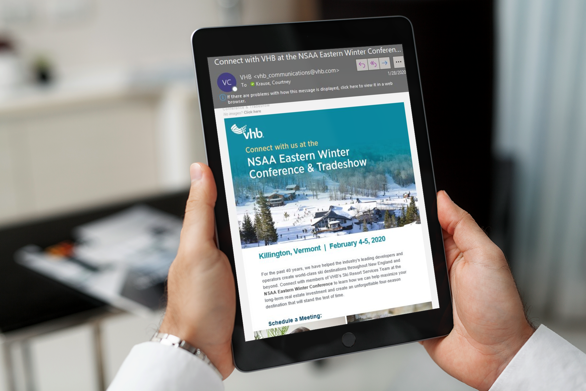
An example of an eblast sent to 2,500+ clients
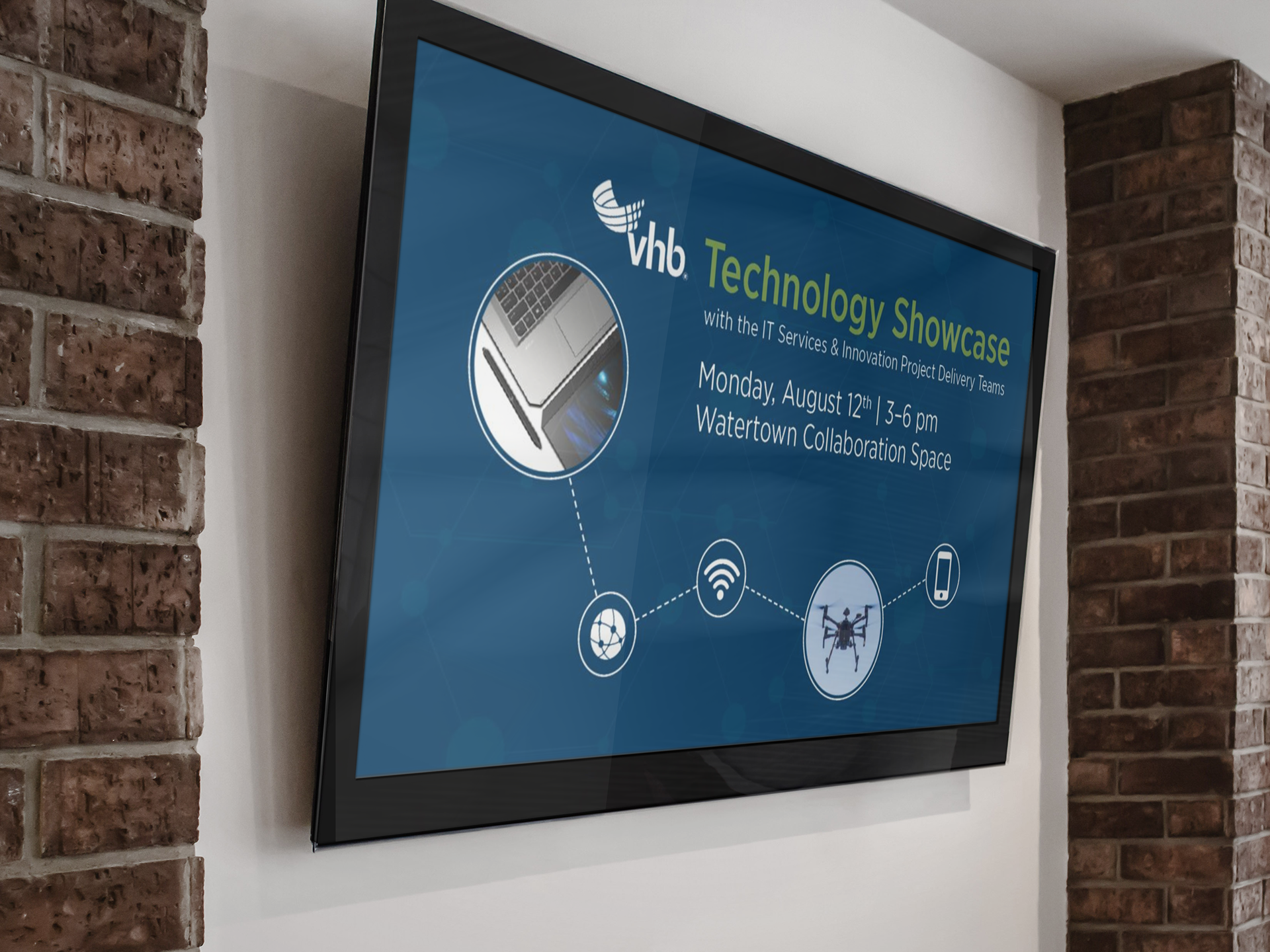
Lobby Screen design for a company-wide event
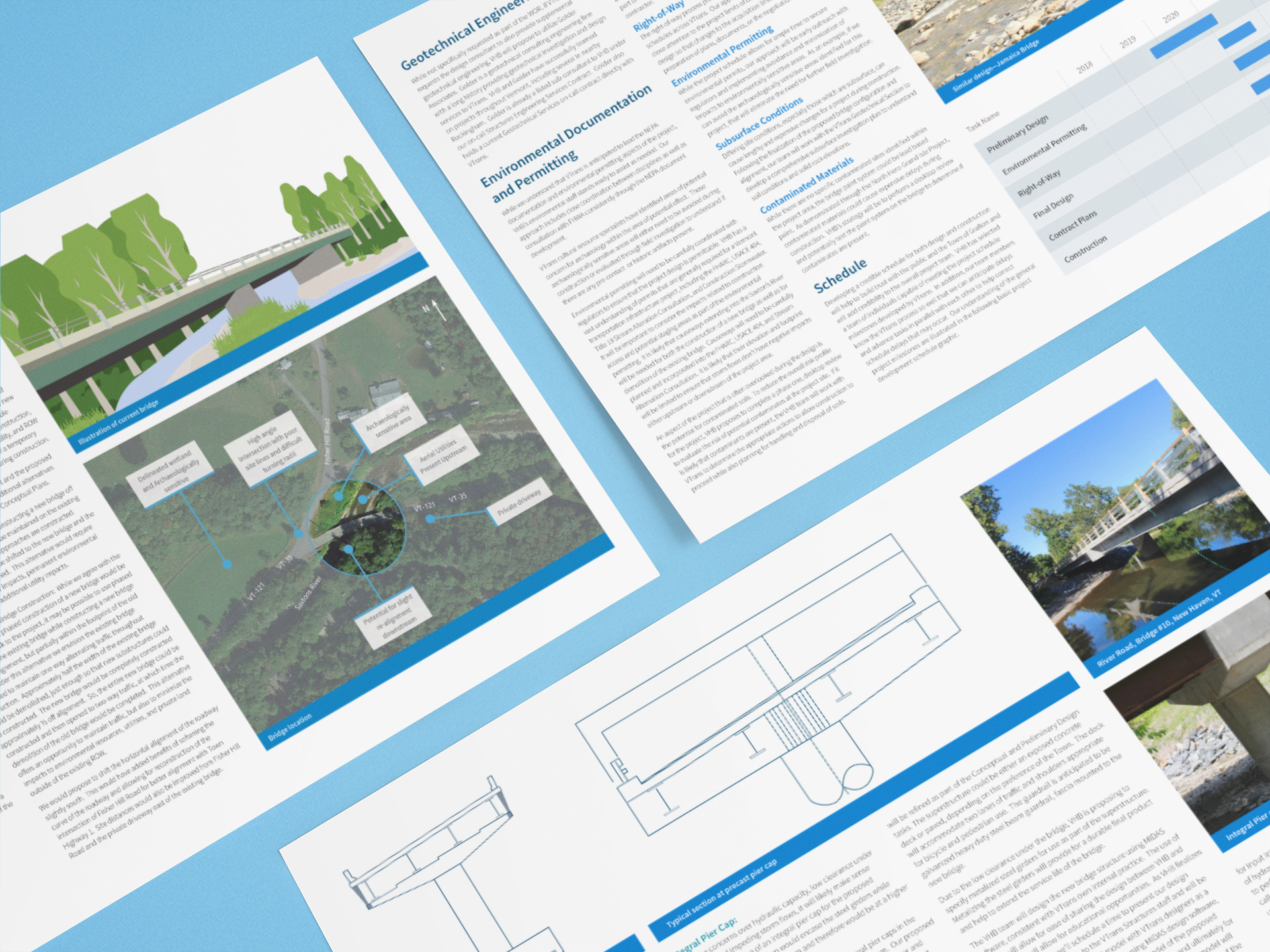
A report design that features a vector illustration of the construction site, a schedule of the project, and vectors of the pier cap designs.
A mockup of a graphic-heavy proposal for the Henry County Transit Master Plan. This is an example of most of the work that I do as a Designer at VHB. I mostly specialize in proposal design which can include graphics such as charts, schedules, organization charts, infographics, and some photography.
I was tasked with creating a new logo for the company's SAM IS software (Smart Asset Management and Inventory System). The software was merging with our Healthy Communities initiative, and the team wanted a logo that combined the two. Above are the original logo designs. One major detail was to remove the face from the "M" because it didn't feel sophisticated. Below shows my process and some of my iterations that were presented.

Playing with the base type
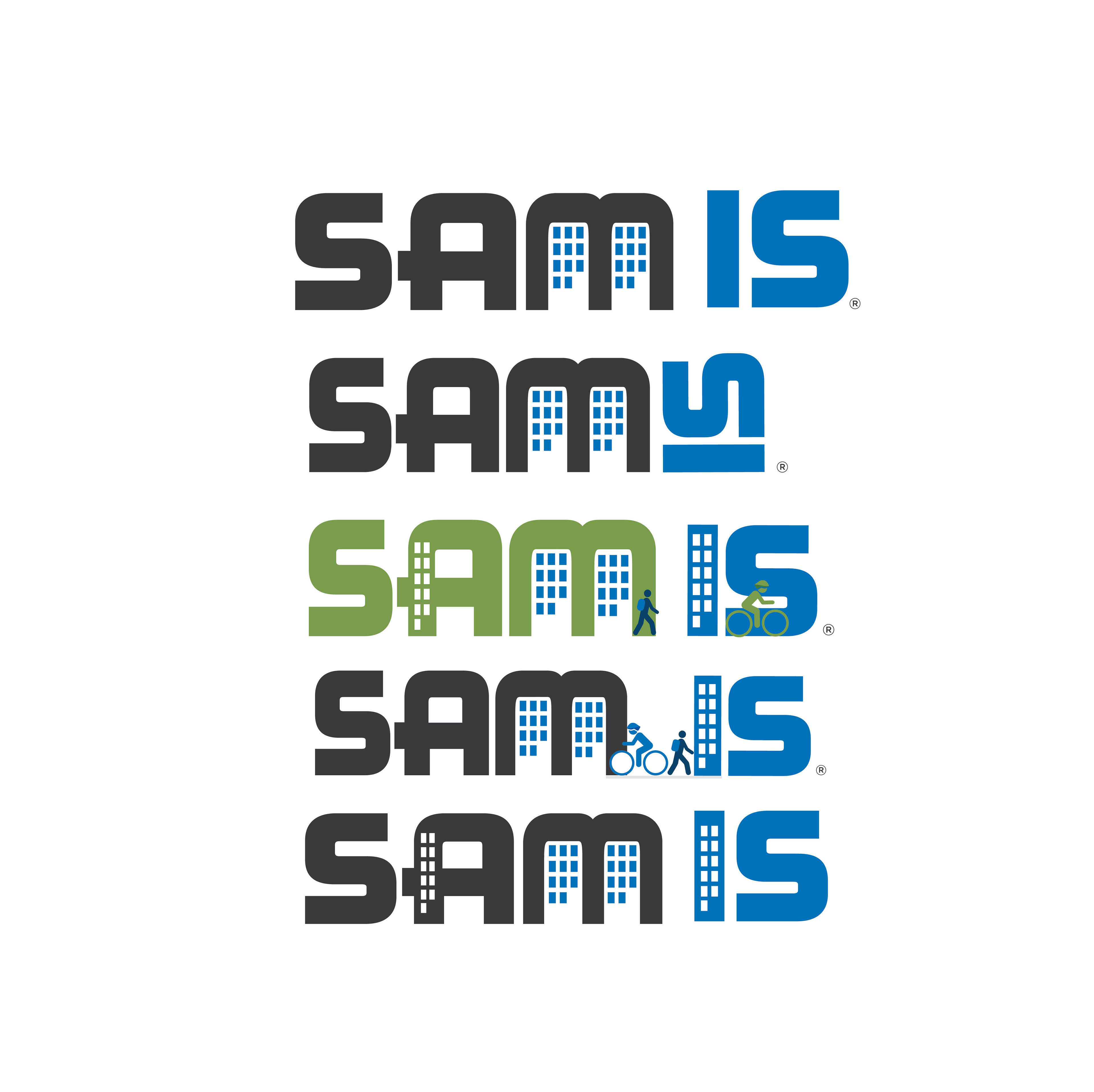
Fully combining the two logos in linear form

Keeping the integrity of both logos
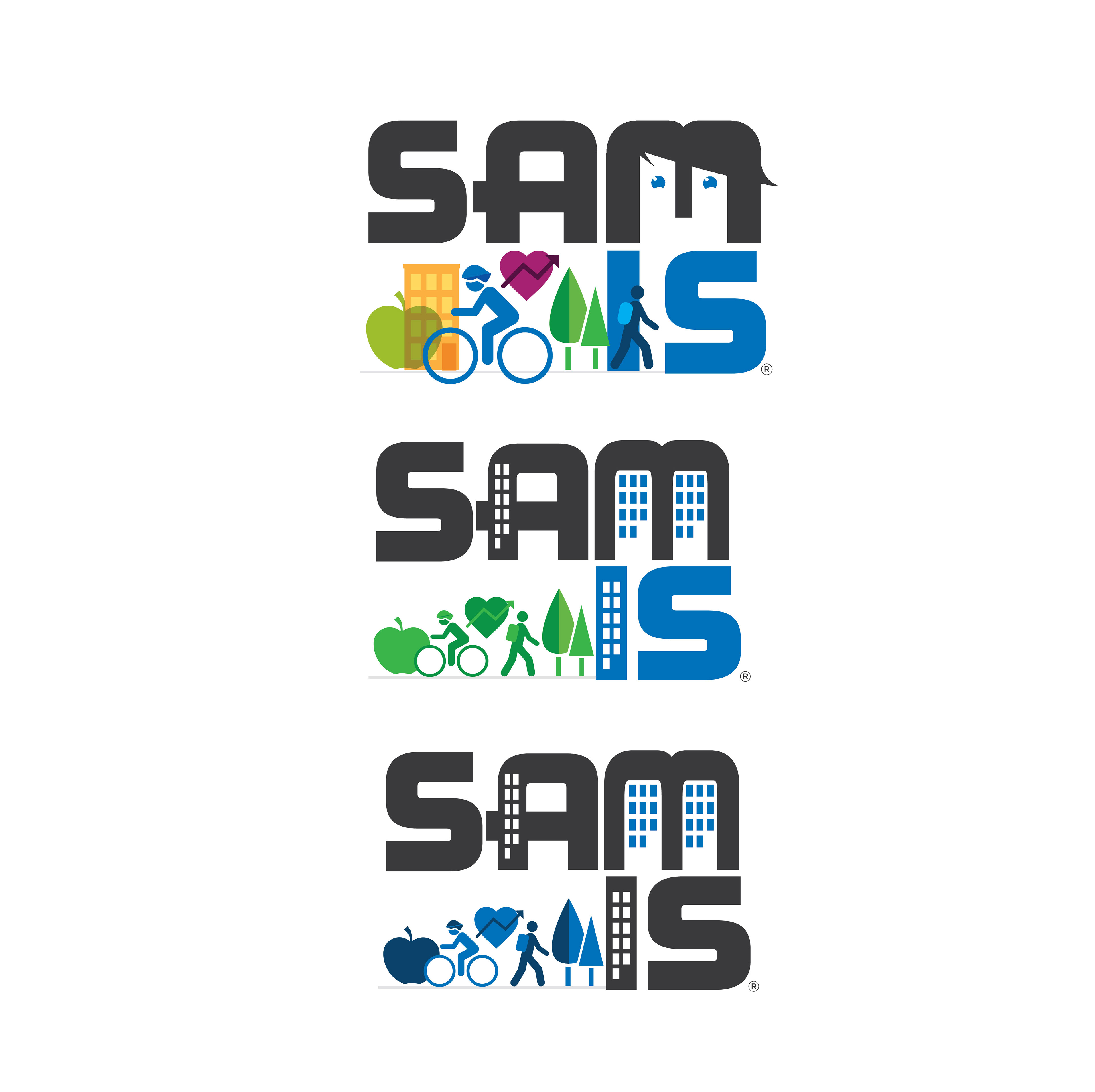
Playing with hierarchy
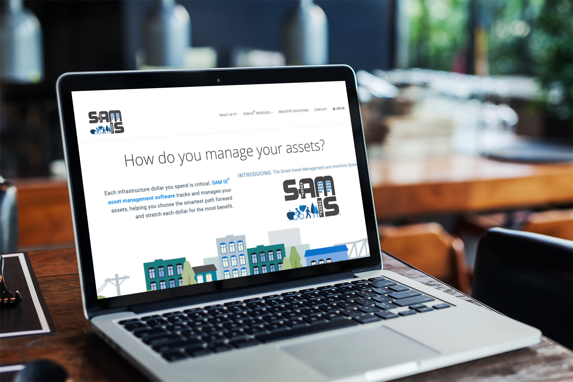
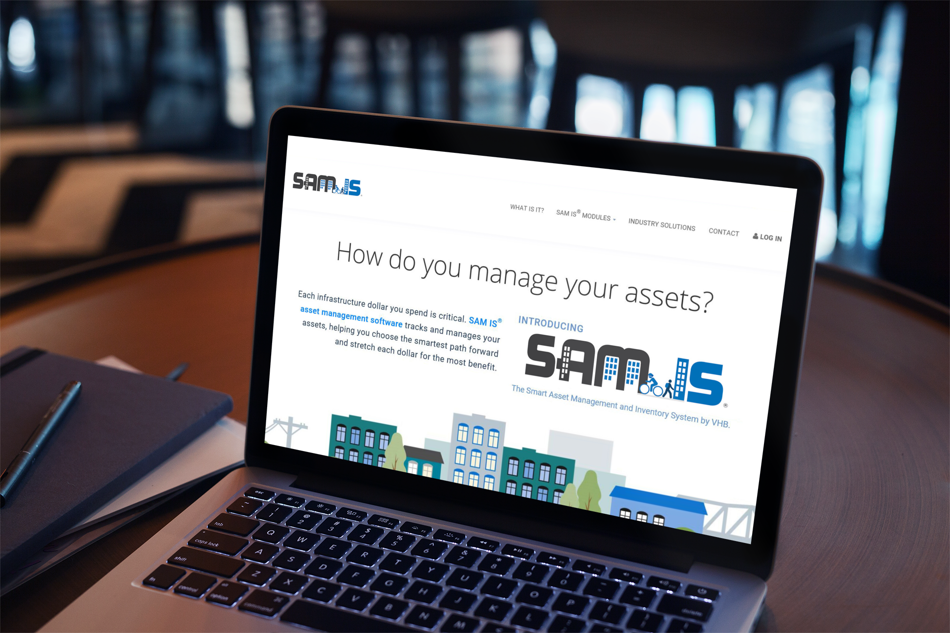
Examples presented to show how the different layout affects the look and feel of the website. A more linear look is more suitable.
